Mira

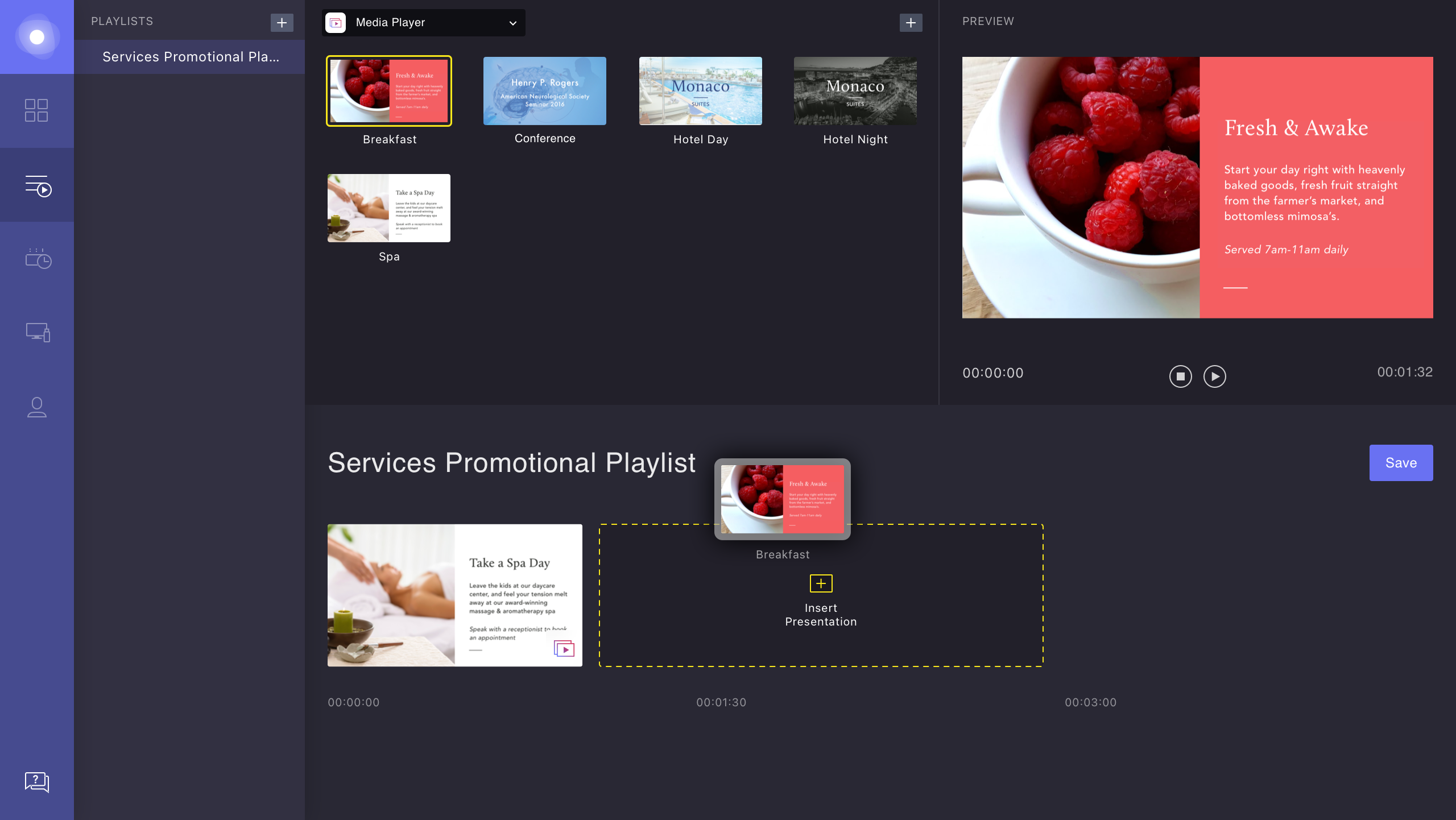
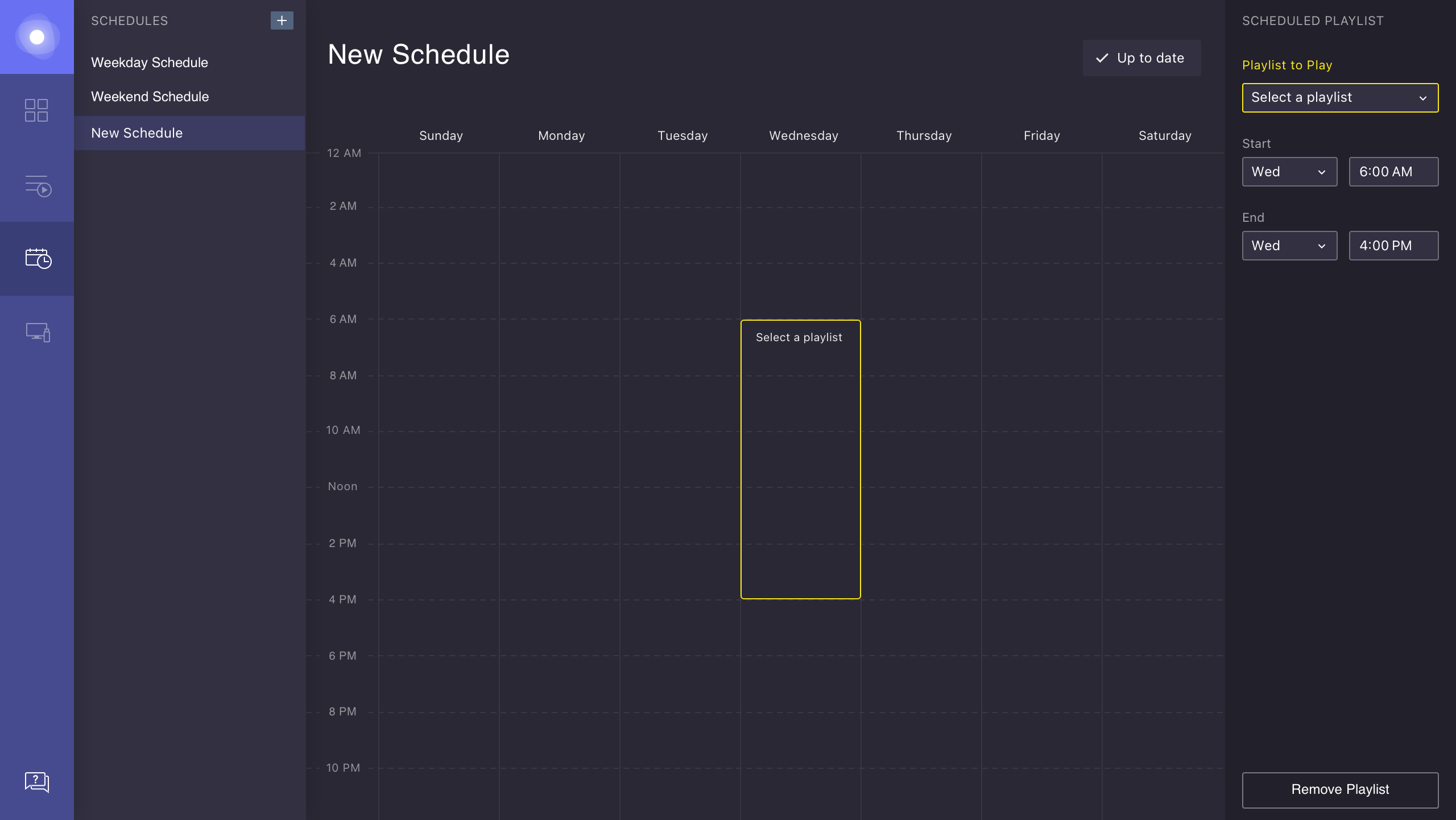
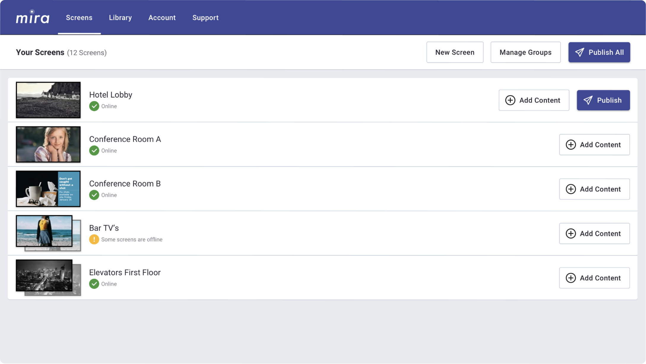
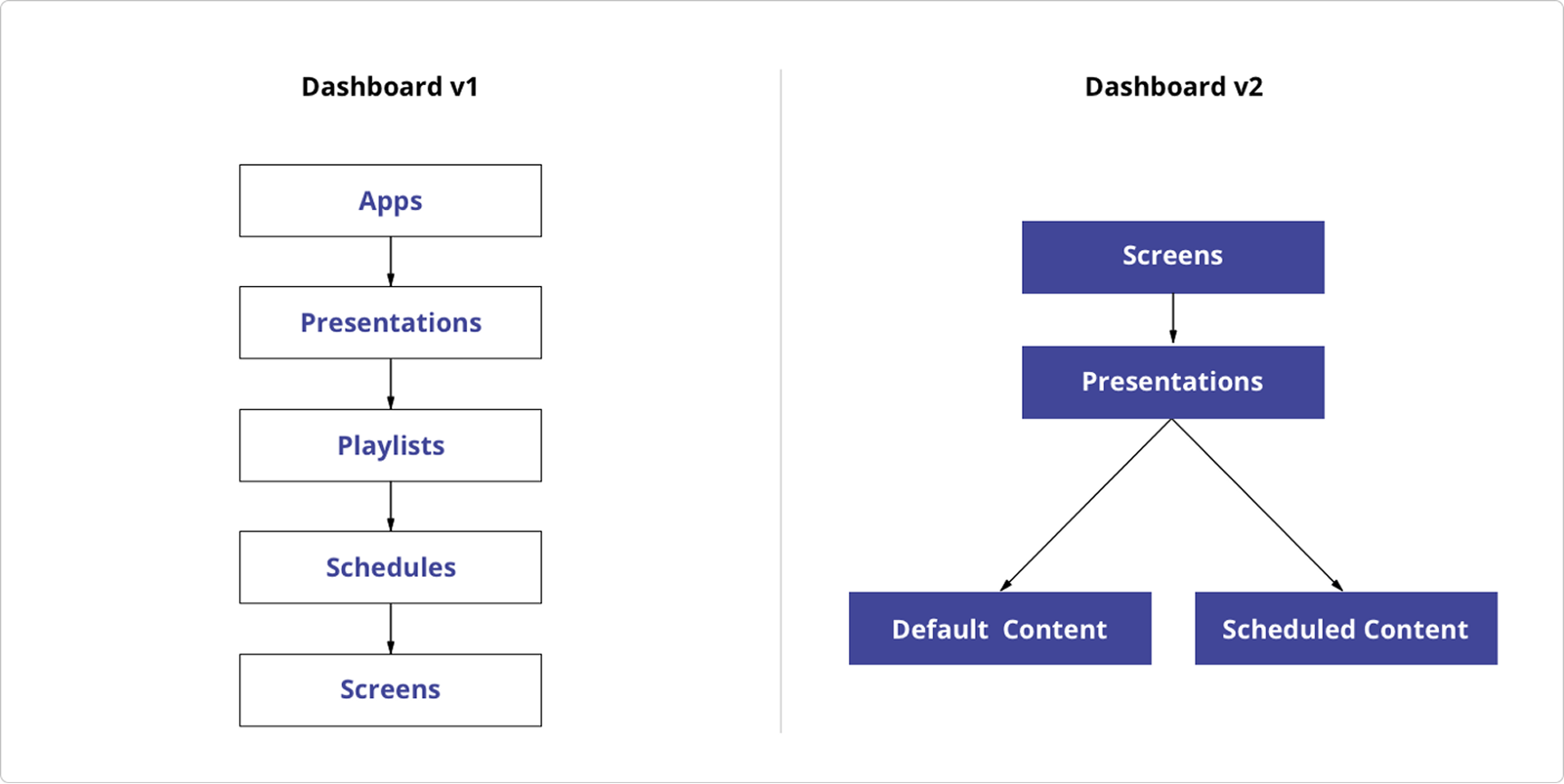
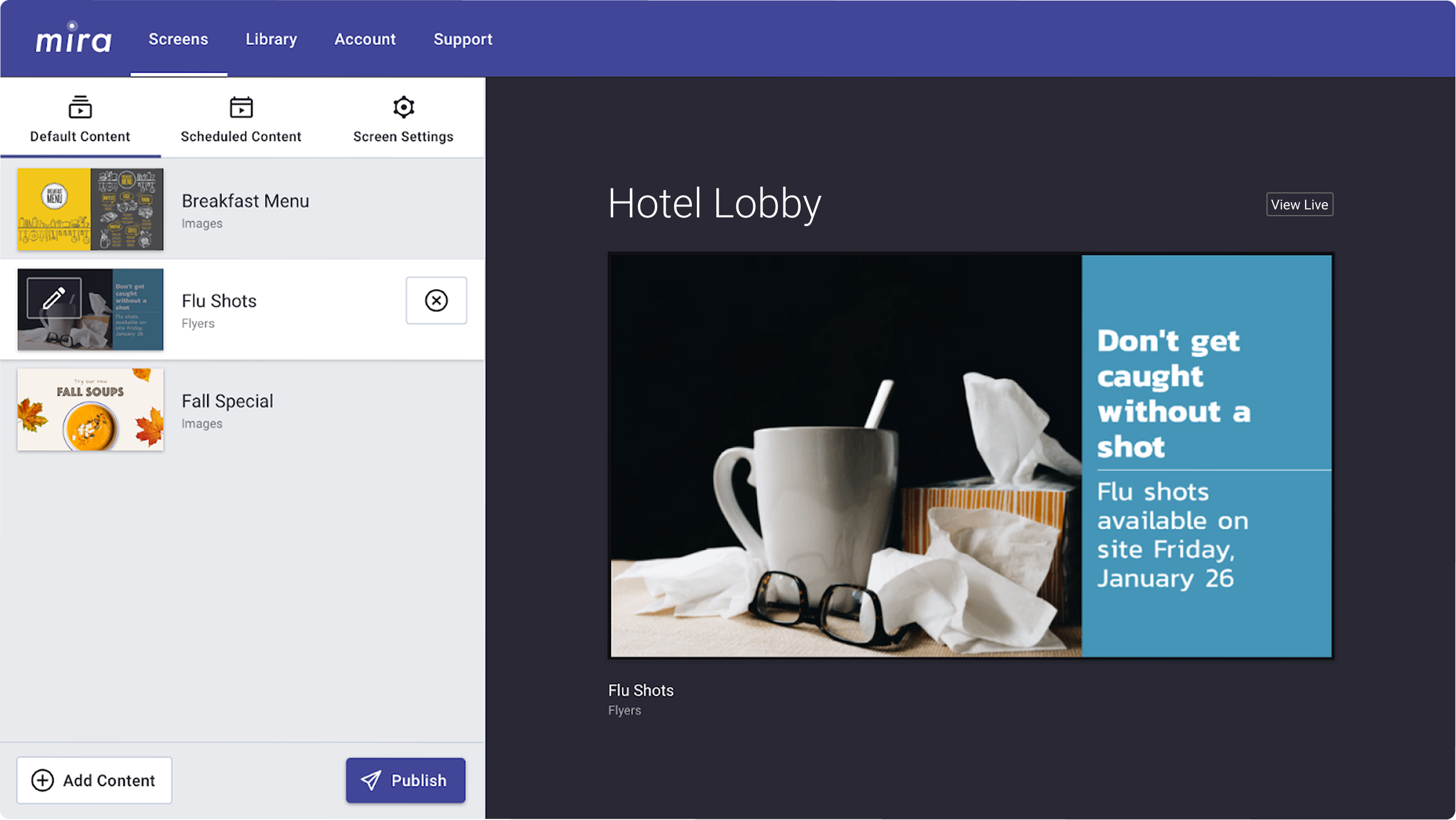
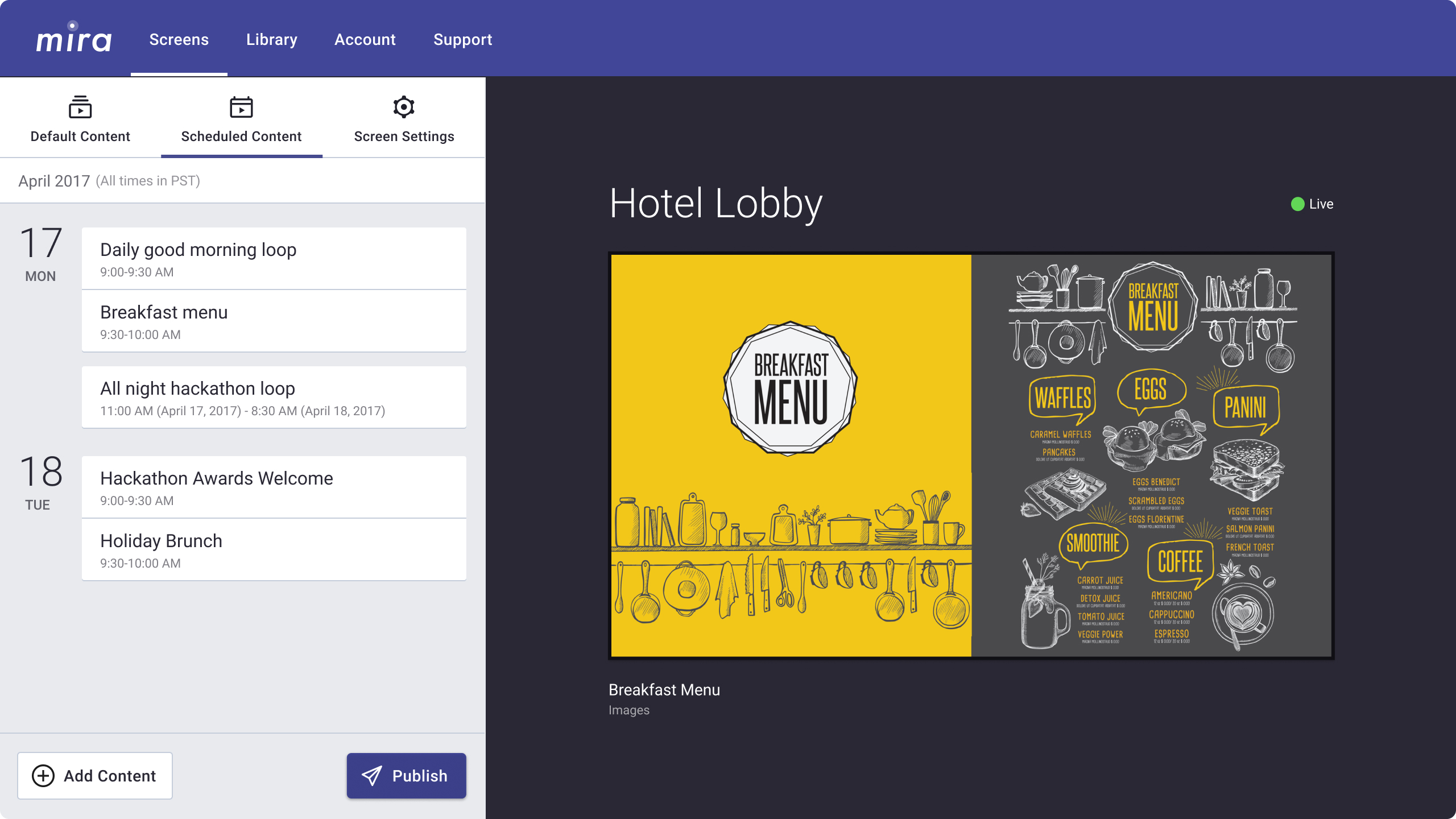
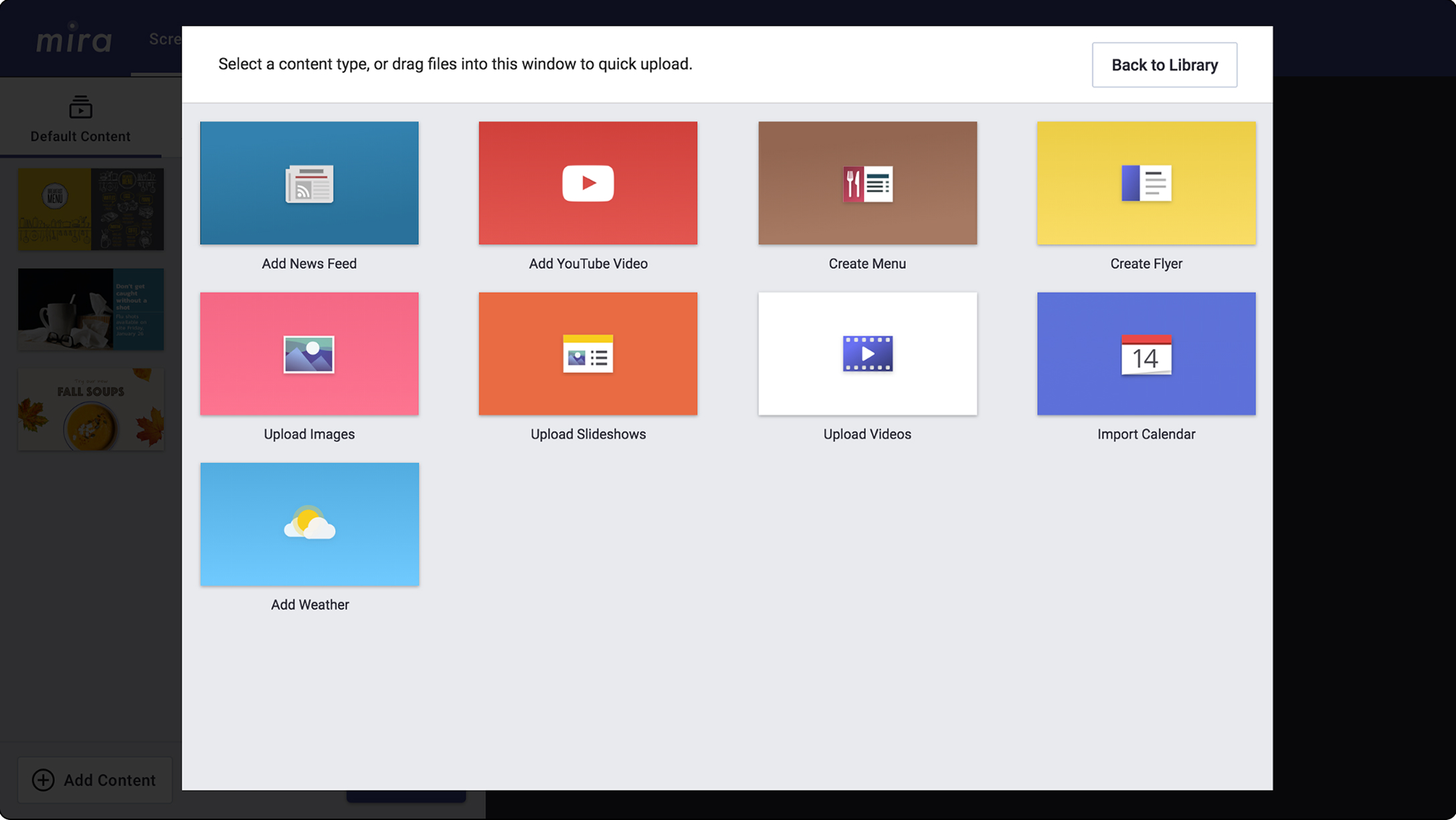
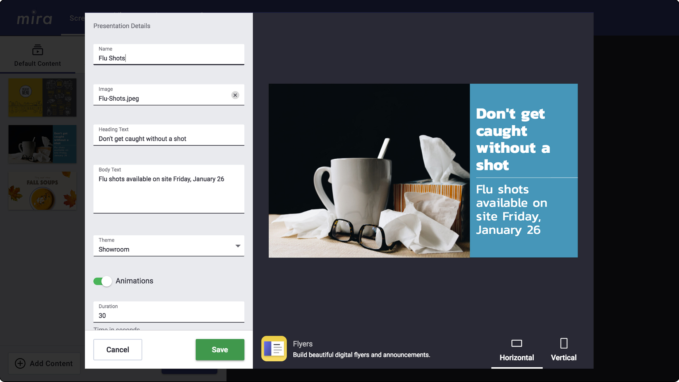
In 2018, I led the redesign of Mira's web dashboard to help less technical business users get content onto their screens faster. By rethinking the core flow, we reduced publishing from 13 to 5 clicks and cut manual onboarding requests by 10x.
Mira (then Raydiant) was acquired by Displai in 2025.
Role
User Research, Prototyping, UX/UI, Design Systems
Timeline
3 months, 2018

Screen signage for any business

Mira's mission was to make screen signage accessible to any business. By connecting TVs to WiFi using a MiraLink device, users could create and publish content from anywhere using an online dashboard. By 2017, Mira had around 100 business customers using v1 of our platform.
Adding content to a playlist in Dashboard v1

Dashboard v1 was doing too much

Before launch, we had designed v1 based on conversations with enterprise sales leads. These had many screens, specific scheduling needs, and relatively tech savvy end-users.

However, as our customer base grew instead with mostly smaller businesses, we learned that our scheduling tools were too granular and complex for their needs, evidenced by hundreds of manual onboarding and support calls.
Scheduling a playlist in Dashboard v1

Publishing required redundant steps

Dashboard v1 followed a strict, linear flow:
App → Presentation → Playlist → Schedule → Publish

However, usage data revealed that 3 of 5 playlists contained a single presentation, and 7 of 10 schedules were set to run 24/7. Most customers just wanted to display one or two things on each screen, looping indefinitely.

Introducing

Dashboard v2

Dashboard v2 starts with screens instead of apps.

A friendlier, screen-first experience

We observed that users were thinking about screens first, not apps, so we restructured the flow to align with that mental model. I validated the approach with wireframe prototypes and refined it through rapid, iterative testing with small cohorts of 2–3 users.

Introducing two content types

Now, each screen or group of screens had two types of content: default content that loops continuously and scheduled content that temporarily takes over for events or promotions. This removed unnecessary steps from the core flow and better matched the real-world needs of our customers.
Default vs. scheduled content

Using progressive disclosure

Leaning into modal workflows allowed us to reduce the amount of content on each screen and make each next step more obvious. Along with the light color scheme, the simplified interface made Dashboard v2 feel more like a consumer product than an intimidating enterprise tool.
We reframed content types as actions, rather than apps

Flexible inputs for any app

The builder modal uses input fields to create and edit any content type, whether static (like images) or dynamic (like weather). Its generic interface makes it easier to develop new screen content types either in house or with partners.
Demo the builder ↗
Two content types shown in the builder modal

Outcome

Fewer clicks, fewer calls

Dashboard v2 updates led to a drastic decrease in the level of support that customers needed to create and publish their content. Based on feedback, they almost universally found the new interface intuitive and self-explanatory.

62%

fewer clicks to publish

10x

fewer onboarding calls

Business owners approve

Amazing, simple to use, and has easily broadcast our food pictures and videos to our customers! Love it.
Angelo
The Baked Apple Breakfast Co.
Using Mira is simple. Exploring how to add content to the Mira library was fun and we use photos just by uploading, typing a few lines, and publishing. That easy.
Denise
Ramada Spokane Airport
Lets a novice like me create professional content. So easy to use, you can change the screens in a matter of seconds.
Linda
Pinot's Palette