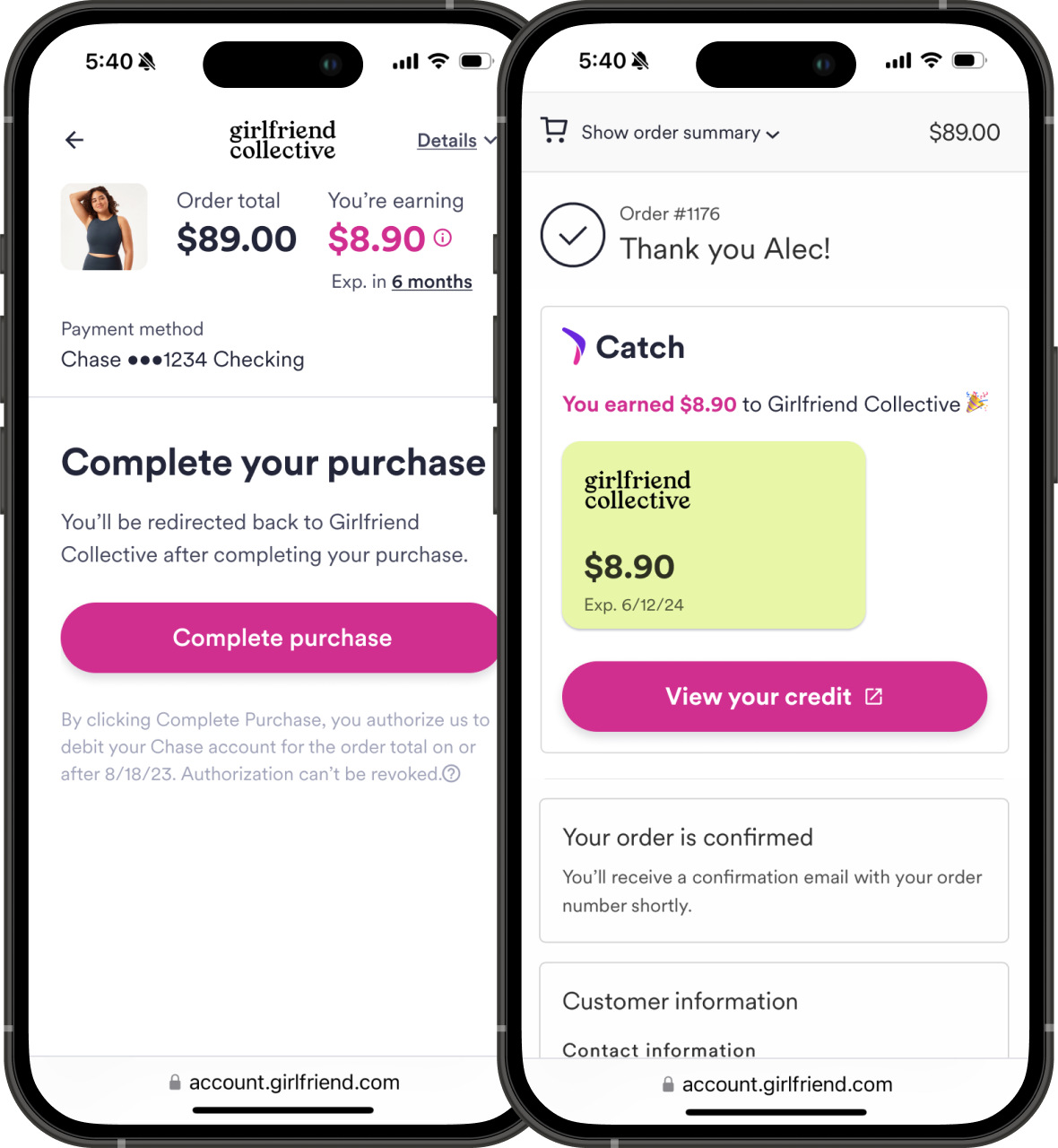
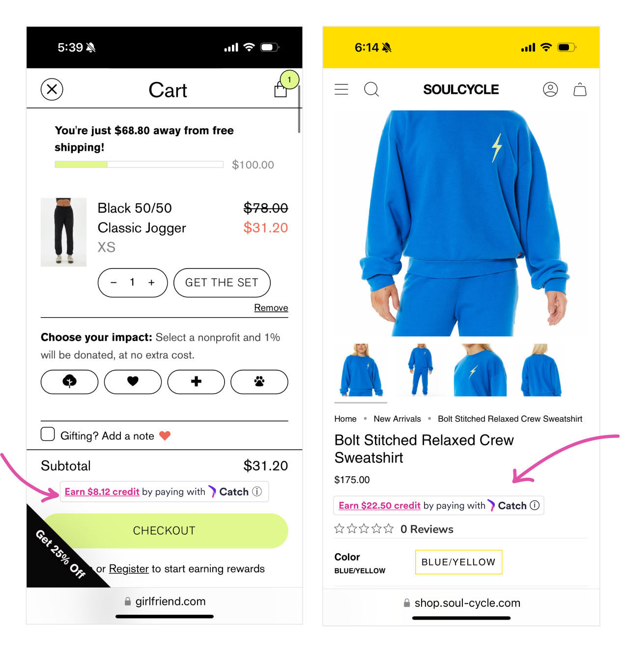
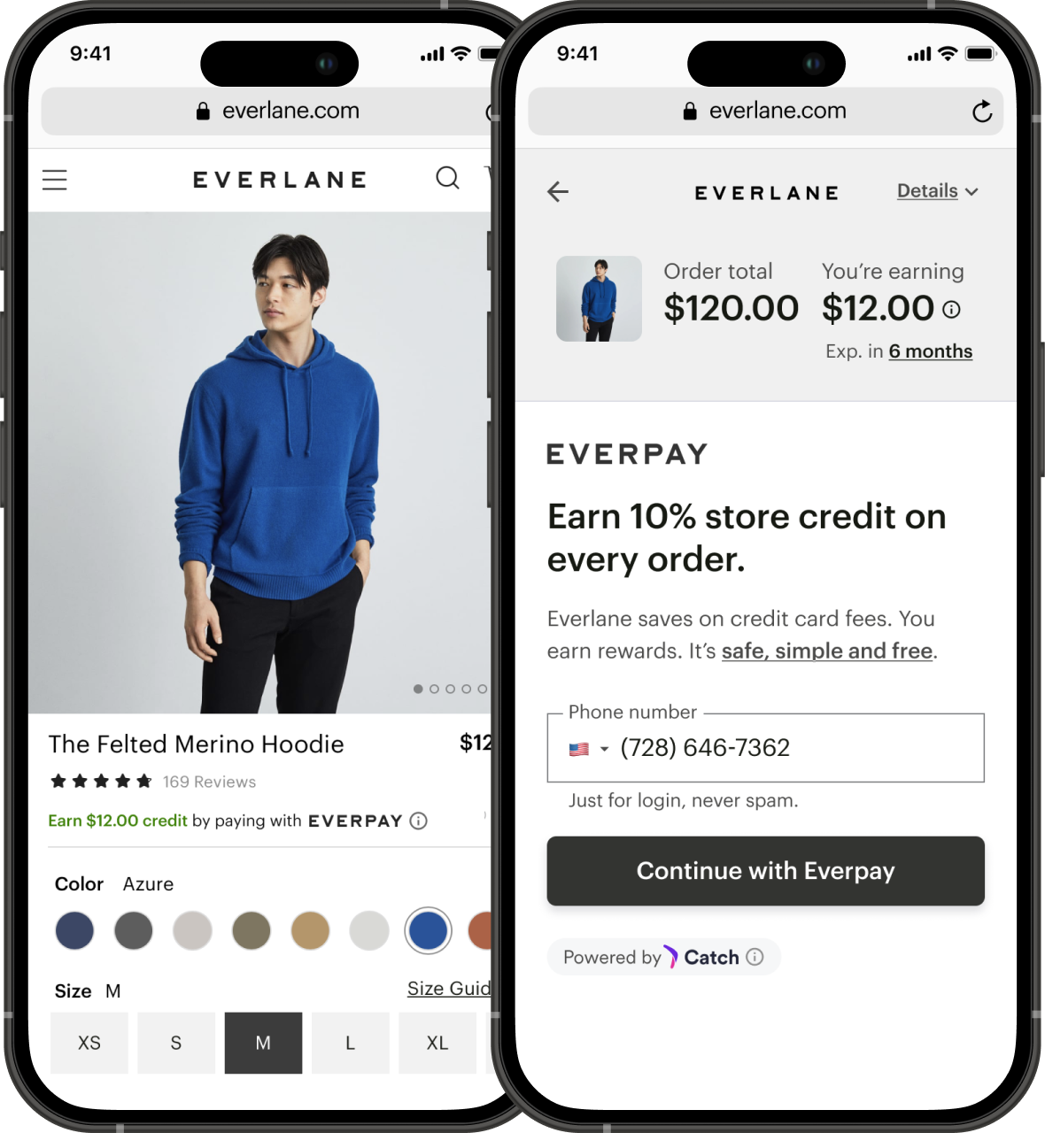
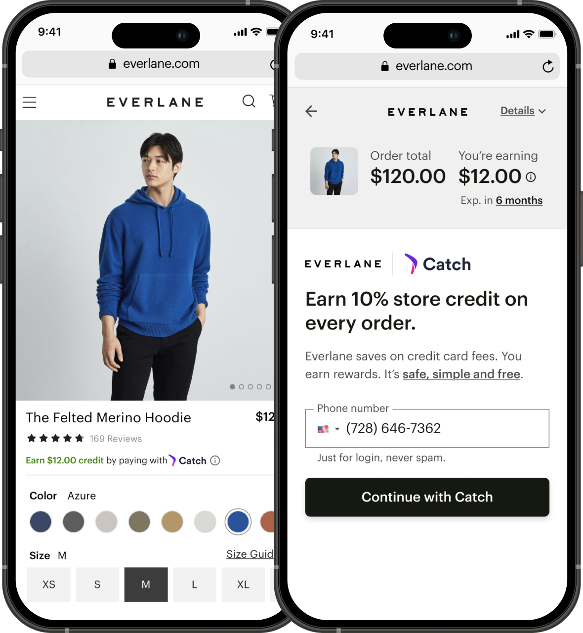
Catch x Everlane

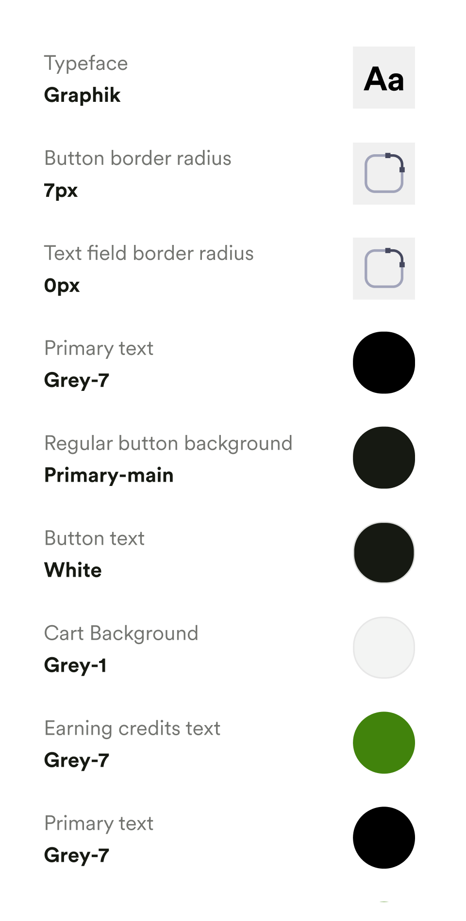
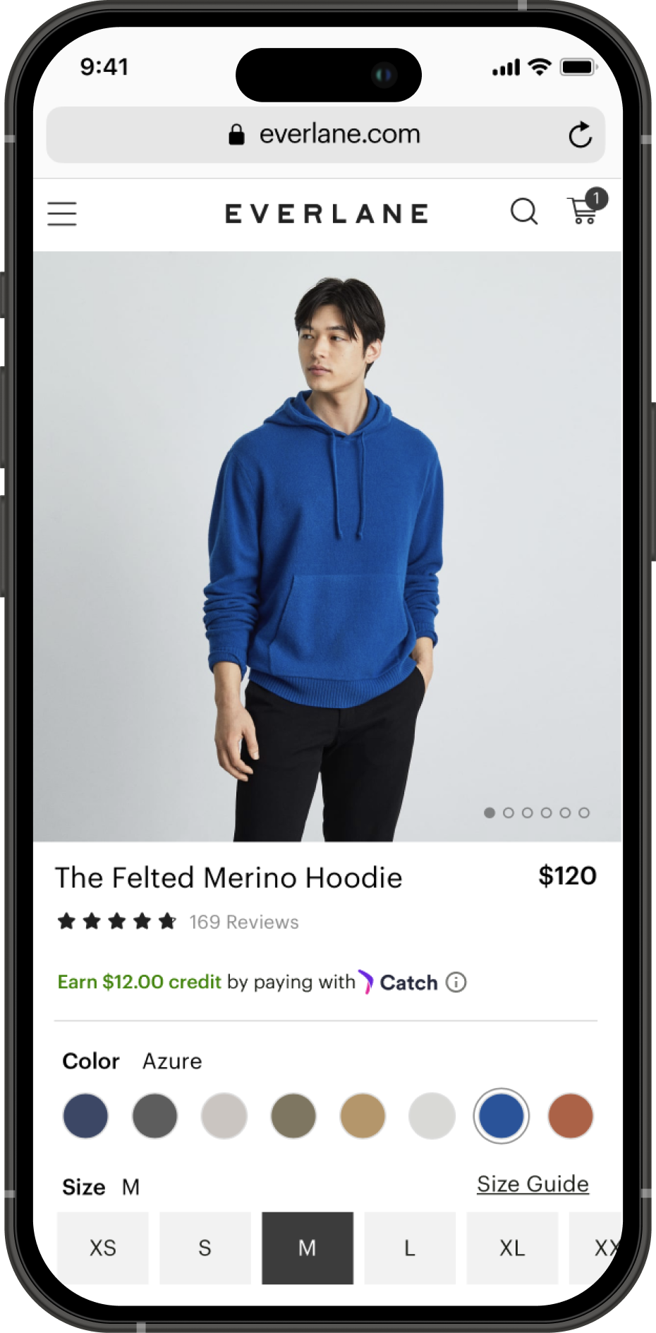
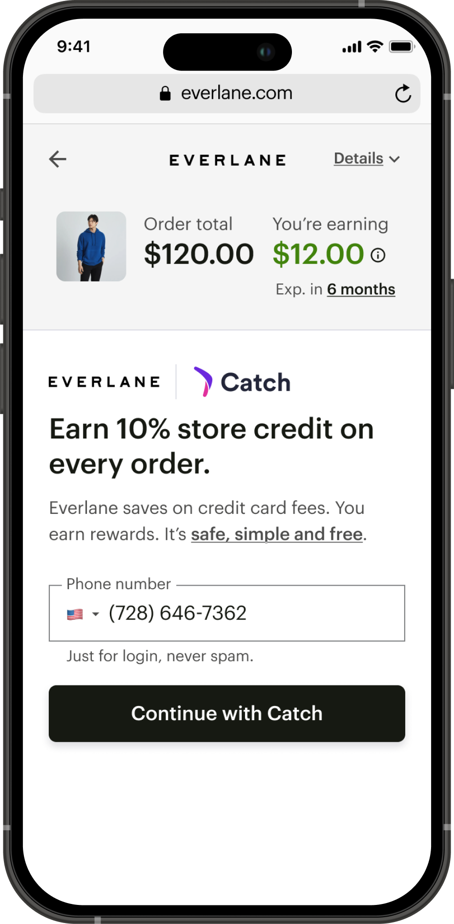
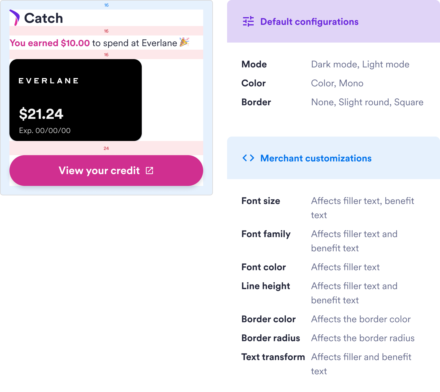
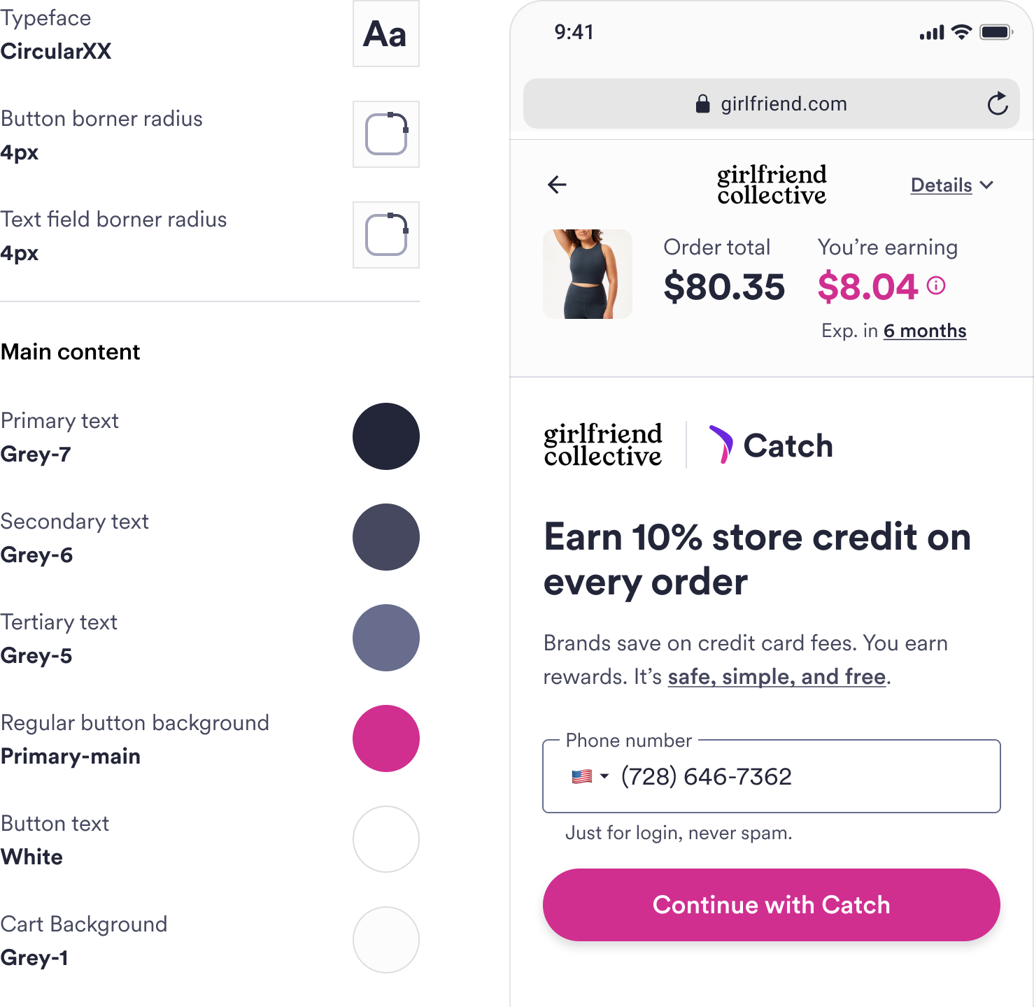
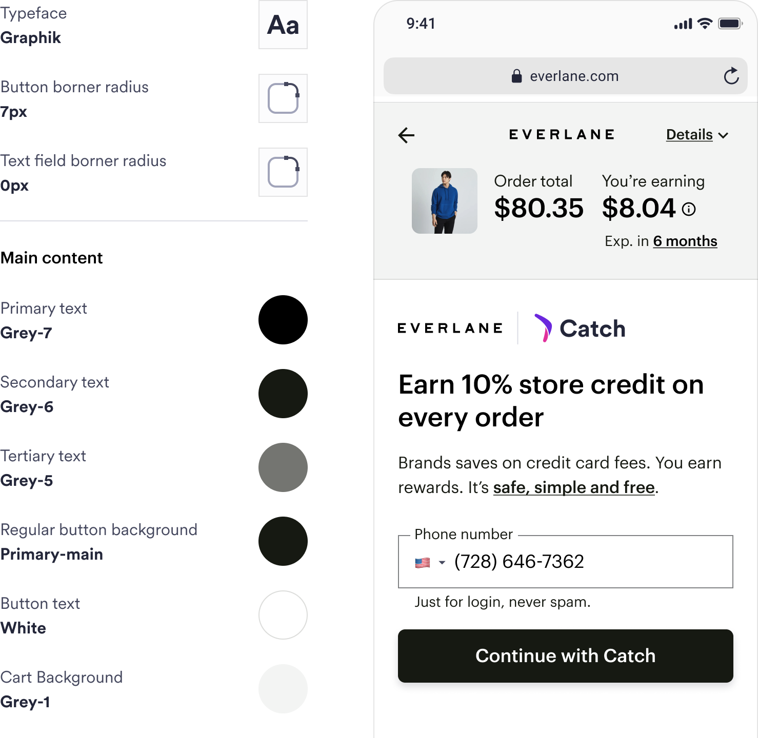
As an online payment method, most users discovery Catch while shopping on merchant sites. However, our Catch-branded components didn't feel at home on every site, which was a dealbreaker for larger brands. Partnering with Everlane's design team, we explored the impact of a more co-branded experience. The outcome was a flexible design language that helped us launch with Everlane, unify our shopping experience and set us up for success with future partners.
Role
User Research, Prototyping, UX/UI, Design Systems
Timeline
2 months, 2023

70% of users find us on partner sites

Catch lets users earn rewards by paying with their debit card or bank account. Partner brands promote Catch by adding a set of components we provide to their websites.
Upfunnel messaging
Dynamic messaging on the product detail page (PDP), cart and merchant checkout highlight the benefits of paying with Catch.
Checkout experience
The checkout experience is Catch's core product, letting users connect a payment method and earn rewards on every purchase.

Catch widgets offered a single look

...but our default components didn't suit every brand. This led to custom requests, DIY hacks, broken interactions and a patchy user experience.
Two very different brands. Same Catch widget.

Consistency vs. customization

Users wanted Catch to be easy to find and consistent across sites, while merchants also wanted it to match their brand and be easy to configure. To grow, Catch needed to adapt to the more specific needs of larger merchants.

Exploring the impact of co-branding

Everlane's leadership was excited to integrate with Catch, and curious about creating an Everlane-branded payment method. Their fantastic design team was open to working with us on a solution.
❌ Everlane branded
While Everpay branding made the initial experience feel seemless, it was hard to explain to users that what they were creating was actually a Catch account. We didn't observe an increase in trust or excitement.
✅ Co-branded
Using Catch branding, but Everlane styles, participants still felt that the checkout process was cohesive with the rest of their Everlane shopping experience, but it raised fewer questions about who was doing what.

Themeable upfunnel components

To enable Everlane's and future integrations, I worked with our engineers to convert static upfunnel components into a system of dynamic widgets all made up of the same themable atoms.
Each widget had default configurations for merchants who wanted to change the theme without any code.
Since some brands wanted to change things like font styles, we built logic for each atom to automatically respond to additional customization.

Style tokens that map to any palette

By letting merchants apply their colors, typeface and other styles, we could offer them a co-branded experience without having to maintain any variations of our product architecture or flow.
Default Catch Theme
Everlane Theme

Outcome

A consistent user experience

Although the Catch experience won't look exactly the same on every site, it will be constructed with the same building blocks – and it's more likely it will be there at all.

Components that meet partner needs

Brands that want Catch components to look more at-home on their site now have theming tools, as well as the ability to customize further without breaking or replacing things.

Potential to launch with big brands

Our work helped set us up for success as we set out to integrate with larger merchants. It also enabled a successful launch with Everlane, quickly making them one of our most popular brands.